Hybrid App 表单组件设计实现(Vue 版)
App 改版了,表单经过重新设计,需要实现新的表单组件。由于参考了 Material Design,故以 md 为命名空间。
设计如图:
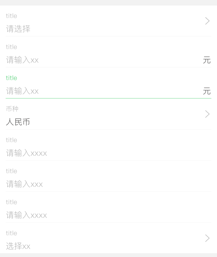
可以将其拆分为以下几个组件:
| 名称 | 描述 |
|---|---|
| md-form | 多个表单组件的外层容器 |
| md-form-item | 表单项,用来包裹标题与输入组件等 |
| md-form-label | 表单项标题 |
| md-input | 输入组件-单行文本 |
| md-select | 输入组件-选择 |
| md-textarea | 输入组件-多行文本 |
拆解如图:
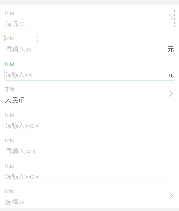
md-form
仅作为容器,提供样式。
<template lang="pug">
.md-form
  slot
</template>

<script>
export default {
  name: 'md-form'
};
</script>
md-form-item
基本表单项。
每个 md-form-item 包含:
- label
- input
- bottom
3 个 slot,分别对应标题组件、输入组件和其他元素。
由于一些操作要求点击整个表单项即触发,所以要在 .md-form-item 绑定 click 事件,并在当前实例上触发($emit)它。
md-form-item 需要能够获取到输入组件的 focus 状态:输入组件通过 $parent.$emit 在 md-form-item 触发事件,md-form-item 可以监听实例上的 focus 和 blur 事件。
<template lang="pug">
.md-form-item(
  @click="handleClick",
  :class="{ active: focus, arrow: arrow, 'input-focus': focus && focusType === 'input' }"
)
  slot(name="label")
  slot(name="input")
  slot(name="bottom")
  .md-input-border(v-if="!borderless")
  arrow-right(v-if="arrow")
</template>

<script>
const getInitialData = () => {
  return {
    focus: false,
    focusType: ''
  }
};

export default {
  name: 'md-form-item',
  data: getInitialData,
  props: {
    borderless: {
      type: Boolean,
      required: false,
      default: false
    },
    arrow: {
      type: Boolean,
      required: false,
      default: false
    }
  },
  mounted() {
    this.$on('focus', this.onFocus);
    this.$on('blur', this.onBlur);
  },
  methods: {
    handleClick() {
      this.$emit('form-item:click');
    },
    onFocus(e, type) {
      this.focus = true;
      this.focusType = type;
    },
    onBlur(e, type) {
      this.focus = false;
      this.focusType = '';
    }
  }
};
</script>
md-form-label
普通的 label 组件,用来展示表单项的标题。由于标题可能不是纯文本格式,所以需要使用 slot 的方式传入标题。
<template lang="pug">
.md-form-label
  slot
</template>

<script>
export default {
  name: 'md-form-label'
};
</script>
md-input
单行文本输入组件,使用 input 元素。
subfix slot 用于显示单位之类的内容。
value 与 this.$emit('input', val) 可以使 md-input 支持 v-model。
input 元素上 blur、focus 事件触发时,会通过 this.$parent.$emit('focus', event, 'input') 传到父元素,'input' 用于区分 input、select 与 textarea。
<template lang="pug">
.md-input
  input.md-input-input(
    :type="type",
    :value="value",
    :placeholder="placeholder",
    :step="step",
    :maxlength="maxlength",
    @input="handleInput",
    @focus="handleFocus",
    @blur="handleBlur",
  )
  slot(name="subfix")
</template>

<script>
const getInitialData = () => {
  return {
    focus: false
  }
};

export default {
  name: 'md-input',
  data: getInitialData,
  props: {
    value: {
      type: String,
      required: true
    },
    type: {
      type: String,
      required: false,
      default: 'text'
    },
    placeholder: {
      type: String,
      required: false
    },
    maxlength: {
      type: Number,
      required: false
    },
    step: {
      required: false
    }
  },
  methods: {
    handleInput(event) {
      const val = event.target.value;
      this.$emit('input', val);
    },
    handleFocus(event) {
      this.focus = true;
      this.$emit('focus', event);
      this.$parent.$emit('focus', event, 'input');
    },
    handleBlur(event) {
      this.focus = false;
      this.$emit('blur', event);
      this.$parent.$emit('blur', event, 'input');
    }
  }
};
</script>
md-select
选择输入组件,点击外层 md-form-item 会触发本组件上的 click 事件,调出实际的选择组件(actionsheet 等)。
<template lang="pug">
.md-select
  .md-select-placeholder(v-if="value == null") {{ placeholder }}
  .md-select-value(v-if="value != null") {{ value }}
</template>

<script>
const getInitialData = () => {
  return {
  }
};

export default {
  name: 'md-select',
  data: getInitialData,
  mounted() {
    this.$parent.$on('form-item:click', () => {
      this.onFormItemClick();
    });
  },
  props: {
    value: {
      required: true
    },
    placeholder: {
      type: String,
      required: false,
      default: ''
    }
  },
  methods: {
    onFormItemClick() {
      this.$emit('click');
    }
  }
};
</script>
md-textarea
多行文本输入组件,使用 textarea 元素,与 md-input 类似。
<template lang="pug">
.md-textarea
  textarea.md-textarea-textarea(
    :value="value",
    :placeholder="placeholder",
    :rows="rows",
    :maxlength="maxlength",
    @input="handleInput",
    @focus="handleFocus",
    @blur="handleBlur",
  )
</template>

<script>
const getInitialData = () => {
  return {
    focus: false
  }
};

export default {
  name: 'md-input',
  data: getInitialData,
  props: {
    value: {
      type: String,
      required: true
    },
    placeholder: {
      type: String,
      required: false,
      default: ''
    },
    maxlength: {
      type: Number,
      required: false
    },
    rows: {
      required: false,
      default: 4
    }
  },
  methods: {
    handleInput(event) {
      const val = event.target.value;
      this.$emit('input', val);
    },
    handleFocus(event) {
      this.focus = true;
      this.$emit('focus', event);
      this.$parent.$emit('focus', event, 'textarea');
    },
    handleBlur(event) {
      this.focus = false;
      this.$emit('blur', event);
      this.$parent.$emit('blur', event, 'textarea');
    }
  }
};
</script>
总结
由于目前设计比较简洁,所以并不需要使用 functional 组件即可实现。组件嵌套使用了 slot,组件间的通信使用了 vm.$emit 与 vm.$on,通过 vm.$parent 访问父组件实例。